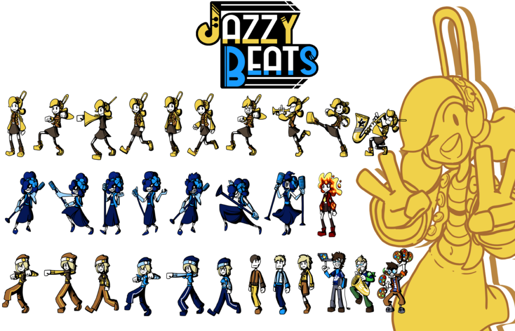
Hello there. I’ve come to talk a bit about the art direction of Jazzy Beats. As usual with our games, we’ve got a dedicated programmer who can barely doodle and a dedicated artist whose programming knowledge dates to 2002’s HTML classes. We’ve also got a cool audio guy around. But my point is, a game like this one was only possible because of division of labor.
So I want to talk about the art. First thing first, the program I used is the free open source Krita, which I use for all of my drawings, spriting and what not. All of our other games’ art have been made with it too. The banner as well. And while any digital painting tablet works just fine, I do happen to have a Cintiq display. That’s a year and a half worth of commissions though!
Now, what was my workflow to make as many of these sprites as possible? Well, since I did dabble a bit on Unity this time around, the idea was to make “basic poses” only, and manage the transitions through simple Unity movements, like bouncing. So, I didn’t have to sprite all the frames. That would have been unreasonable for a project like this. Heck, thiswas unreasonable. My wrist ended up aching so much by the time of the deadline. But it was well worth it!

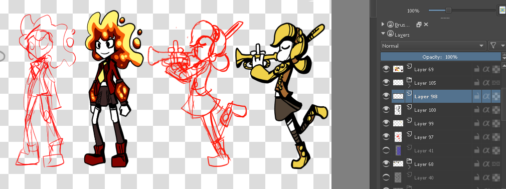
So, by making quick sketches first, then lining them up, coloring and adding extra details, I was able to make a pose. Then another, and another, and so on. Because of time, I had to cut on corners wherever it was possible, so most characters have the same poses. And for purposes of gameplay, some characters are only recolors:

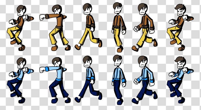
However, I didn’t just want to make the recolors be recolors for gameplay purposes. There’s a lot of colorblind people out there, so, trying to make it as accessible as possible, I tried to reverse the values of clothes. Note how the yellow guy has bright pants, while the blue character has a light shirt instead. I admit my ignorance when it comes to how colorblindness works, but I want to say that at least I tried to accommodate.
Finally, since the game was about a very crowded street, I wanted to make as many enemies as possible. Time was a constrain, so there’s only 4 different looks (8 if you count the recolored versions). Cutting corners, the second version of characters were just a new layer of stuff above the old one, with some minor tweaking here and there. For example, the second male fan was the same with a goatee, different hair, a scarf and boots. Here’s how the final sheet for the yellow alternate fan looks like:

’m extremely satisfied with the results. If you happened to be the artist of your game, I’d like to know about your own experiences when working on it, so do let me know!
Here’s the link to the game again, in case you’d like to see these in motion. And do leave us some comments if you’d like me to check out your games as well, since I’m really pushing on Feedback Friends this time around. In behalf of my team, we hope you’re having as much playing games as we are. Cheers! ?
