On my previous post, I talked a bit about why the art of our game, Wizsnooks, looks like that, mostly showcasing some assets. Today, however, I want to bring up something a bit more meaty instead. Say, how about a step-by-step deployment of an asset?
And what better than doing that by showcasing bad guys? I mean, Kroltan already showed you the guts of the game, while also proving once more than old-timey cartoon villains are the best. So, let’s go from there.
Remember, the tool I’m using is Krita, which is completely free and downloadable from here. To make the best use of it, you need a digital painting tablet. This can still be done with a mouse, but it may take way more time. Getting a 50~100USD tablet is a wise investment.
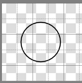
Wizsnooks is snooker or pool, mixed with roguelike fantasy elements. So, clearly, our enemies will also need to be pool balls. So, the assets begin with a simple circle over a backgroundless layer.
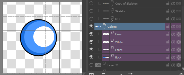
Below it, I filled the layer with color, which can easily be later shaded and recolored for different enemies. The less layers you use, the quicker you can do the process, but with a color and a shade on different layers, you can have more customization in the future.
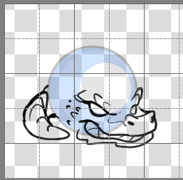
When I had the ball done (which was layer copied, pasted and edited multiple times to make a sheet), I proceeded to sketch enemies. Each sheet consisted of an Idle pose and a Rolling set of poses. The plan was to make the idle look menacing, like an enemy should, while the rolling was meant to look funny.
So, I turned down the opacity of the ball, and sketched on a new layer above them. Then, when I was done sketching, I would make yet another layer with the lineart, and delete the sketch.
I later colored on a layer below it. There’s techniques such as coloring over alpha and the like, but I’m mostly just going with the basic instructions. This is how the colored layer looks under the lineart.
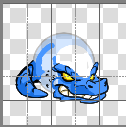
And here’s how it looks with the opacity of the ball at 100%.
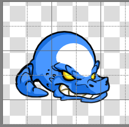
Needless to say, the process is repeated for every pose. Because these are circles, it would have been simple to just draw over the circle, like the protagonist, and be done with it.

However, that was by design to allow the player to look good with helmets and swords. The enemies, to outstand, would need a bit of volume, so there were parts that needed to stick out.


And there it is. Now, Jorge made an animated version of the Dragon Orb (which we affectionately call Dragorb). Here’s the cute little fellah.
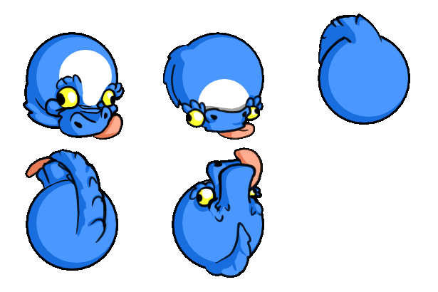
That’s pretty much all there is on the subject. Feel free to ask any questions or the like about the development of these assets or the use of Krita. I’ll try to answer to the best of my ability.
Here’s hoping you get a chance to see the whole thing come alive by playing Wizsnooks, available on your browser and downloadable for Windows, Mac and Linux. If you want to chat, this Discord server is where it’s at. And last but not least, here’s the Whales and Games Twitter, so you can keep in contact with us.
In behalf of our team, we hope that you have a fantastic judging phase. We’ll continue to check more games, so be sure to put your best face. Cheers! ?
